
Jerry Seinfeld writes one joke per day. No matter what happens that day, he writes a joke.
For motivation he uses what’s become known as the Seinfeld Calendar: You get a big calendar and for every day that you write a joke, you put a big bright red X on your calendar
After a few days you’ll have a chain. Just keep at it and the chain will grow longer every day. You’ll like seeing that chain, especially when you get a few weeks under your belt. Your only job next is to not break the chain.
Don’t break the chain
Of course it’s 2017 now so there’s an app for that.
My favorite was the Commit app by Nathan Barry. I loved its simplicity, but it no longer works in iOS11 and Nathan has removed it from the App Store. No updates I guess …
So I built a clone tribute. Here’s how
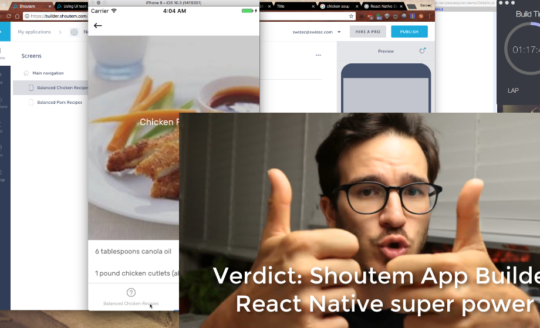
This React Native tutorial will focus on using Shoutem Themes for styling and designing the app. That’s the fun part of this build.
We use Redux for state and redux-storage to automatically persist our Redux store to React Native AsyncStorage. This was just as easy as I had hoped. You can read more about it in the last section.
Total build time about 7 hours. 5 hours for the visual stuff, 2 hours to wire it up with Redux and tweak visuals.
You can see the full Code on Github
The necessary boilerplate
Here’s the React Native boilerplate you’ll need to get started:
$ react-native init CommitApp --version=react-native@0.43.4
$ cd CommitApp
$ npm install --save @shoutem/ui @shoutem/theme lodash react-redux redux redux-logger redux-storage redux-storage-engine-reactnativeasyncstorage
$ react-native link
That gives you the needed dependencies: Shoutem libs for styling, Lodash for data wrangling, Redux for state.
You also need to create a src/ and src/img directory.
$ mkdir src
$ mkdir src/img
And you should download my background image and put it in src/img/background.jpg. I googled “free textures” to find it.
Last boilerplate step is to gut index.ios.js and index.android.js and make the main component look like this:
// index.ios.js / index.android.js

import App from './src';

export default class CommitApp extends Component {
  render() {
    return (
      <App />
    );
  }
}
Now let’s build that <App />
Design 3 beautiful screens
Our app consists of 3 screens:
- editing a Commitment
- viewing a Commitment
- viewing a completed Commitment
Commitments are objects following this shape
{
    commitment: "string",
    remindAt: "string",
    doneDates: [Date, Date, ...]
}
commitment is something you want to do every day, remindAt is when you want to be reminded, and doneDates is a list of timestamps when you tapped “YES DID IT”. We can derive the rest.
1) New Commitment
The first screen lets users commit to something new.

We have two input fields – commitment and remindAt – and a big fat Commit button. We manage input fields with component state and trigger an onCommit callback when the user presses that big shiny button.
The full EditingCommitment component is 78 lines so I’m not going to paste it here.
The interesting part of EditingCommitment is the render method. It looks like this:
// src/EditingCommitment.js

    render() {
        const { id, commitment, style } = this.props;

        return (
            <View style={style.main}>
                <View styleName="sm-gutter-top lg-gutter-left lg-gutter-right">
                    <Heading style={style.text}>I am going to</Heading>
                    <View style={style.textCommitment}>
                        <TextInput value={this.state.commitment}
                                   onChangeText={this.onChangeCommitment}
                                   autoCapitalize="none"
                                   style={style.input}
                                   autoFocus={true} />
                    </View>
                    <Heading style={style.text}>every day</Heading>
                </View>
                <View styleName="lg-gutter-top lg-gutter-left lg-gutter-right">
                    <View styleName="horizontal">
                        <Heading style={style.smallText}>Remind me at</Heading>
                        <View style={style.smallInput}>
                            <TextInput value={this.state.remindAt}
                                       onChangeText={this.onChangeRemindAt}
                                       autoCapitalize="none" />
                        </View>
                    </View>
                    <Heading style={style.smallText}>just in case I forget.</Heading>
                </View>
                <View styleName="center xl-gutter-top lg-gutter-left lg-gutter-right">
                    <CircleButton styleName="green large" text="Commit" onPress={this._onCommit} />
                </View>
            </View>
        )
    }
We’re using a combination of style and styleName attributes to style everything. Shoutem Themes pass styles down the style prop, which we use instead of providing our own hardcoded objects. Adding styleName gives us component variants.
Our EditingCommitment component is a type of Commitment component
// src/Commitment.js
import { connectStyle } from '@shoutem/theme';
import { Dimensions } from 'react-native';
import EditingCommitment from './EditingCommitment';
import DisplayCommitment from './DisplayCommitment';

class Commitment extends Component {
    constructor(props) {
        super(props);

        this.state = {
            editing: props.id === 'ADD'
        }
    }

    onEdit = () => { this.setState({
        editing: true
    }) }

    render() {
        const { editing } = this.state,
              { commitment, style } = this.props;

        if (editing) {
            return (<EditingCommitment {...commitment} style={style} />)
        }else{
            return (<DisplayCommitment {...commitment}
                                       style={style} />)
        }
    }
}
The main Commitment component has an editing flag in its state. If that’s true, it renders <EditingCommitment>, if not, it renders <DisplayCommitment>. Both get props from the commitment data, and a style prop.
Shoutem Themes for styling
The style attribute that we pass onto child components comes into <Commitment /> via a style prop. How?
Like this:
// src/Commitment.js
export default connectStyle('CommitApp.Commitment', style)(Commitment);
connectStyle is a lot like Redux’s connect function. It says we want to connect this component to our global styles. Those come from a <StyleProvider> in our <App> component.
That little style argument going into connectStyle is important. It defines our component’s default styles and looks like this:
// src/Commitment.js
const style = {
    main: {
        backgroundColor: 'rgba(0,0,0,0)',
        paddingTop: 100,
        width: Dimensions.get('window').width
    },
    day: {
        height: 60,
        borderRadius: 10,
        flex: 1,
        margin: 1,
        '.done': {
            backgroundColor: 'rgba(255, 255, 255, .9)',
        },
        '.undone': {
            backgroundColor: 'rgba(255, 255, 255, .4)'
        }
    },
    input: {
        backgroundColor: 'rgba(0, 0, 0, 0)',
        fontSize: 38,
        height: 50,
        lineHeight: 50,
        color: 'white',
        padding: 0
    },
    smallInput: {
        width: 150,
        borderBottomColor: 'white',
        borderBottomWidth: 1,
        paddingLeft: 5,
        'shoutem.ui.TextInput': {
            backgroundColor: 'rgba(0, 0, 0, 0)',
            width: 150,
            fontSize: 24,
            height: 30,
            lineHeight: 30,
            padding: 0,
            color: 'white'
        }
    },
    text: {
        fontSize: 38,
        height: 50,
        lineHeight: 50,
    },
    textCommitment: {
        borderBottomColor: 'white',
        borderBottomWidth: 1,
        'shoutem.ui.Heading': {
            fontSize: 38,
            height: 50,
            lineHeight: 50
        }
    },
    smallText: {
        fontSize: 24,
        height: 30,
        lineHeight: 30
    }
}
That’s a boring read, I know, but notice the details:
- Top level styles become our
style.somethingobjects. We pass those into components and they get styled. - These styles apply to both
<EditingCommitment>and<DisplayCommitment>. Total reuse - We can nest style definitions!
<Heading>children ofstyle.textCommitmentgetfontSize: 38for example. There’s a few cases of that behavior. - We can define variants, like in the
'.done','.undone'case. When you use astyleName="done"next tostyle={style.day}it looks different thanstyleName="undone"
What’s more, we can define further styles for our component at the top level In src/index.js we have a global theme passed into a <StyleProvider> like this:
// src/index.js

import UITheme from '@shoutem/ui/theme';

const App = ({ commitments }) => {
    let list = Object.keys(commitments)
                     .sort((a, b) => a < b ? -1 : (a > b ? 1 : 0));

    return (
        <StyleProvider style={theme}>
            <Screen>
                <StatusBar barStyle="light-content" />
                <Image styleName="background" source={require('./img/background.jpg')} />
                <ListView data={list}
                          renderRow={(id) => <Commitment id={id} key={id} />}
                          horizontal={true}
                          pageSize={1}
                          snapToInterval={Dimensions.get('window').width}
                          snapToAlignment="center"
                          decelerationRate={0}/>
            </Screen>
        </StyleProvider>
    )
});

const theme = Object.assign(UITheme(), {
    'shoutem.ui.Image': {
        '.background': {
            flex: 1,
            resizeMode: 'repeat',
            position: 'absolute'
        }
    },
    'shoutem.ui.Heading': {
        color: 'lightcyan',
        '.variable': {
            color: 'white'
        }
    },
    'shoutem.ui.Text': {
        color: 'lightcyan',
        '.variable': {
            color: 'white'
        }
    },
    'shoutem.ui.Title': {
        fontSize: 18,
        color: 'lightcyan',
        '.variable': {
            color: 'white'
        }
    },
    'shoutem.ui.ListView': {
        backgroundColor: 'rgba(0, 0, 0, 0)',
        flex: 1
    },
    'CommitApp.CircleButton': {
        '.green': {
            main: {
                backgroundColor: 'limegreen',
            },
            caption: {
                color: 'white'
            }
        },
        '.transparent': {
            main: {
                backgroundColor: 'rgba(255, 255, 255, .2)',
                borderColor: 'white',
                borderWidth: 1.5
            },
            caption: {
                color: 'white'
            }
        }
    }
});
Three interesting details to notice:
<StyleProvider>is a lot like a Redux<Provider>– it provides machinery to connect component styles to a global theme- We redefine styles for a lot of built-in Shoutem primitives like
Heading,Text,Title, andListView. We can do that because they’re themable components, much like ourCommitApp.CommitmentandCommitApp.CircleButton. - We can add new variants usable through
styleNameto existing components.Imagegets astyleName="background"variant,TextgetsstyleName="variable"etc.
So how does all this fit together?
Let’s look at the CircleButton component. It’s nice and small.
// src/CircleButton.js

import React from 'react';

import { Text, TouchableOpacity } from '@shoutem/ui';
import { connectStyle } from '@shoutem/theme';

const CircleButton = ({ text, style, onPress, styleName }) => (
    <TouchableOpacity style={style.main} onPress={onPress}>
        <Text style={style.caption}>{text}</Text>
    </TouchableOpacity>
);

const style = {
    main: {
        alignItems: 'center',
        justifyContent: 'center',
    },
    '.large': {
        main: {
            width: 150,
            height: 150,
            borderRadius: 150,
        },
        caption: {
            fontSize: 35
        }
    },
    '.small': {
        main: {
            width: 80,
            height: 80,
            borderRadius: 80,
        },
        caption: {
            fontSize: 25
        }
    }
}

export default connectStyle('CommitApp.CircleButton', style)(CircleButton);
CircleButton is a component that renders a <TouchableOpacity> and a <Text>. It gets styling through Shoutem Themes.
We use style.main for the main style so that React Native doesn’t complain about incorrect styles being passed to some elements. I think it eagerly applies all styles wherever it sees a style={} attribute.
So let’s say we render <CircleButton styleName="large green" />. Shoutem Theme would use the global theme from src/index.js and the local styles from src/CircleButton.js to create this style prop:
{
    main: {
        alignItems: 'center',
        justifyContent: 'center',
        width: 150,
        height: 150,
        borderRadius: 150,
        backgroundColor: 'limegreen',
    },
    caption: {
        fontSize: 35,
        color: 'white'
    }
}
Which we then use as style.main and style.caption to apply to the right children elements.
Neat, right? Certainly made my life easier once I figured it out.
2) View Commitment

With all that theming and styling, our <DisplayCommitment> component is designed already. All we have to do is put it together.
You can see the full component on GitHub. I’m omitting the logic functions because they don’t fit this tutorial.
import React, { Component } from 'react';
import { takeRightWhile, last } from 'lodash';
import { View, Heading, Title, TouchableOpacity, TextInput } from '@shoutem/ui';
import CircleButton from './CircleButton';


const CommitmentDay = ({ done, style }) => (
    <View style={style} styleName={done ? 'done' : 'undone'}>

    </View>
);

class DisplayCommitment extends Component {
    get days() {
        // length of current streak
    }

    get doneToday() {
        // is the last doneDates today?
    }

    get doneList() {
        // list of [true, true, false, false, true] days for the streak render
    }

    onDone = () => {
        if (!this.doneToday) {
            this.props.onDone();
        }
    }

    render() {
        const { id, commitment, onEdit, onDone, style } = this.props;

        return (
            <View style={style.main}>
                <View styleName="sm-gutter-top lg-gutter-left lg-gutter-right">
                    <Heading style={style.text}>Did you</Heading>
                    <TouchableOpacity style={style.textCommitment} onPress={onEdit}>
                        <Heading styleName="variable">{commitment}</Heading>
                    </TouchableOpacity>
                    <Heading style={style.text}>today?</Heading>
                </View>
                <View styleName="center xl-gutter-top lg-gutter-left lg-gutter-right">
                    {!this.doneToday ? <CircleButton styleName="green large" text="Yes" onPress={this.onDone} />
                                     : <CircleButton styleName="transparent large" text="Done" />}
                </View>
                <View styleName="center horizontal xl-gutter-top lg-gutter-left lg-gutter-right">
                    <Title styleName="variable">{this.days}</Title><Title> {this.days === 1 ? 'day' : 'days'} in a row</Title>
                </View>
                <View styleName="horizontal md-gutter-top">
                    {this.doneList.map((done, i) => <CommitmentDay done={done} style={style.day} key={i} />)}
                </View>
            </View>
        )
    }
}

export default DisplayCommitment;
We have a few getters that calculate values computable from state: current streak length, whether we’re done for today, and a list of true/false values to paint the streak visualization.
The render method looks a lot like it did for <EditingCommitment>: We render some text, make the commitment itself tappable to go into edit mode, render a big Yes button, and a streak visualization. That’s going to keep users motivated to do their thing.
Notice that what we didn’t do is define any more styling. It all comes through our Shoutem Theme via the style prop. Nested elements get nested styles, styleName gives us variants of all the things and life is good.

3) Completed Commitment
HA! It’s already there 🙂
Look closely. The tiny doneToday function flips our <DisplayCommitment> component to a completed commitment. All the necessary styling is already in our global theme and we turn it on by changing the styleName passed to <CircleButton>.
Excellent.
Wire them together with Redux
We’ve talked about Redux a lot on this blog, so I’m not going to go into too much detail. The wiring for our CommitApp is relatively simple.
We have two actions:
updateCommitmentwhich takes newcommitmentandremindAtstrings and updates a commitmentdoneCommitmentwhich takes a commitmentidand adds a newdoneDate
// src/actions.js
export const updateCommitment = ({ commitment, remindAt, id }) => ({
    type: "updateCommitment",
    commitment,
    remindAt,
    id
});

export const doneCommitment = ({ id }) => ({
    type: "doneCommitment",
    id
});
Nothing special to see here.
Our reducer looks more interesting, because there’s some dirty. It’s built from 2 reducers:
commitmentis the reducer for a single commitmentcommitmentsis the reducer for a hash ofid: commitmentpairs
// src/reducer.js
const commitment = (state = {}, action) => {
    const { commitment, remindAt } = action;

    switch (action.type) {
        case "createCommitment":
            return Object.assign({}, state, {
                commitment,
                remindAt,
                doneDates: []
            });
        case "updateCommitment":
            return Object.assign({}, state, {
                commitment,
                remindAt
            });
        case "doneCommitment":
            let doneDates = state.doneDates.concat(new Date());

            return Object.assign({}, state, {
                doneDates
            });
        default:
            return state;
    }
}
The single commitment reducer does what you might imagine. Creates a new commitment with an empty doneDates array, updates an existing commitment with new strings, or adds a new doneDate to the list. Makes sense, right?
But notice that we don’t have a createCommitment action. That’s where some creative hackery comes in.
// src/reducer.js

const commitments = (state = {'ADD': EmptyCommitment}, action) => {
    let { id } = action;

    switch (action.type) {
        case "updateCommitment":
            if (id === 'ADD') {
                id = new Date().getTime();
                action.type = 'createCommitment';
            }

            return Object.assign({},
                                 state,
                                 {[id]: commitment(state[id], action)},
                                 {'ADD': EmptyCommitment});
        case "doneCommitment":
            return Object.assign({},
                                 state,
                                 {[id]: commitment(state[id], action)},
                                 {'ADD': EmptyCommitment});
        default:
            return state;
    }
}
That’s our commitments reducer. It builds a mapping of commitment ids to commitment objects. Like this:
{
    12345: {
        commitment: "do dishes"
        remindAt: "6:00 PM",
        doneDates: [ ... ]
    },
    12324: {
        commitment: "feed goldfish",
        remindAt: "2:00 PM",
        doneDates: [ ... ]
    }
    ADD: {
        commitment: "",
        remindAt: "6:00 PM",
        doneDates: []
    }
}
We use ADD as the magic empty commitment. Update that one and you create a new commitment instead. Because ids are creation timestamps and numbers come before letters, we can always sort our commitments by id to get expected sorting.
That’s an intended side-effect of this approach, by the way. Sort by id, then display.
Anyway, changing the action type in your reducer before passing it onto a sub-reducer smells like an anti-pattern. But it saves us typing and simplifies component wiring.
Ye lords of #redux how bad am I for changing action types in reducers before passing them to sub-reducers? pic.twitter.com/GULvWpUkjJ
— Swizec (@Swizec) September 6, 2017
I won’t go into the component wiring because it’s a rote application of wrapping components in connect() calls with appropriate arguments: A function for mapping state to props and a function for mapping dispatch to props.
You can see that on Github, here.
Save it all with redux-storage
And now for my favorite part of this build: Automatic persistence.
We use redux-storage to automatically save our Redux store to React Native AsyncStorage after every action dispatch. It all happens behind the scenes, we just have to set it up.
The saving sequence looks like this:
- Dispatch action
- Reducer computes new state
- redux-storage saves to AsyncStorage
- redux-storage announces it saved

We restore from state with a LOAD action that we dispatch on app start. The whole setup looks like this:
// src/reducer.js
import { LOAD } from 'redux-storage';

const commitments = (state = {'ADD': EmptyCommitment}, action) => {
    let { id } = action;

    switch (action.type) {
        // ...
        case LOAD:
            let commitments = action.payload.commitments,
                ids = Object.keys(commitments);

            Object.keys(commitments)
                  .forEach(id =>
                      commitments[id].doneDates = commitments[id].doneDates
                                                                 .map(d => new Date(d))
                  );

            return { ...commitments };
        default:
            return state;
    }
}
On LOAD, we get our commitments map, instantiate stringified Date objects into real dates, and overwrite Redux state.
We dispatch this load action in src/index.js when setting up our store. Like this:
// src/index.js

import { createStore, applyMiddleware } from 'redux';
import { createLogger } from 'redux-logger';
import { Provider, connect } from 'react-redux';
import createEngine from 'redux-storage-engine-reactnativeasyncstorage';
import * as storage from 'redux-storage';

import rootReducer from './reducer';

const engine = createEngine('com.school.shoutem.CommitApp');
const storageMiddleware = storage.createMiddleware(engine);

const store = createStore(
    rootReducer,
    applyMiddleware(
        createLogger(),
        storageMiddleware
    )
);

const load = storage.createLoader(engine);
load(store);
Create a new storage engine using redux-storage-engine-reactnativeasyncstorage, which does the heavy lifting, put it in storageMiddleware, which coordinates it all, and create a new store. Once we have that, we create a loader and call it.
Calling load(store) reads from AsyncStorage and dispatches the LOAD action.
You can see the whole src/index.js file on GitHub
And that’s how I replicated one of my favorite iOS apps in React Native. Thanks Nathan Barry for the inspiration.
If you enjoyed this tutorial, don’t forget to subscribe.
PS: Exercises left to the reader
There’s some stuff I left out that I’m going to add before I start using this app
- Ability to remove commitments
- Notifications when
remindAttime comes ListViewpage indicator
Have fun ✌️

